Case study • 2024

Stack

A task manager you just talk to.

Role: Product designer Timeline: 2 months Tools: Figma, Notion, Miro
Problem
Task apps add their own work: 2.3 minutes to organise a single task, and 87% of people abandoned tasks that needed more than three fields.
What I did
Studied how people actually describe tasks, then designed capture in plain language that organises itself, tested over three rounds.
Outcome
75% less time organising tasks, 94% organised tasks without any training, and a usability score of 82/100 against 58 for competitors.

Most task managers impose their own structure: projects, priorities, tags, dates, all decided up front. Watching colleagues use popular apps, I kept seeing the same pattern: tasks went in half-organised, then got abandoned.

More on this

Stack replaces forms and extra clicks with plain-language input, so people capture tasks the way they already think about them, and let the app do the organising.

To check the friction was real, and put numbers on it:

  • 18 user interviewsProfessionals who use task management apps every day.
  • Time-motion study12 people observed creating and organising tasks.
  • 6 apps analysedTodoist, Asana, Trello, TickTick, Any.do and Notion.
  • 64 knowledge workers surveyedTheir task habits and pain points.
  1. Sentences, not categories“I need to call Sarah about the project deadline tomorrow” already holds everything a form asks for.Led to: just type it
  2. Every field costs momentum87% abandoned tasks that needed more than three fields; organising one task took 2.3 minutes on average.Led to: showing what it understood
  3. Options overwhelm71% felt overwhelmed by organisational options.Led to: categories that emerge
  4. Creating isn’t completingOnly 23% of tasks were finished within their target timeframe.Led to: measuring completion
Behaviour behind it
  1. Cognitive load grows with every required decision: project, priority, due date, tags.
  2. Moving from thinking to form-filling breaks the momentum of capturing a task.
Problem statement
How might I capture and organise tasks the way people naturally think, so they can focus on getting things done rather than managing their system?
The app

Capture first, organise later

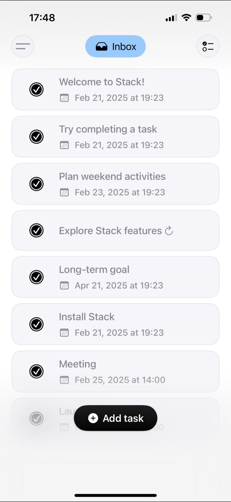
One field to add a task, an inbox that fills itself, and views that sort it.

Key decisions

Three decisions

Each one removes a choice people used to make up front.

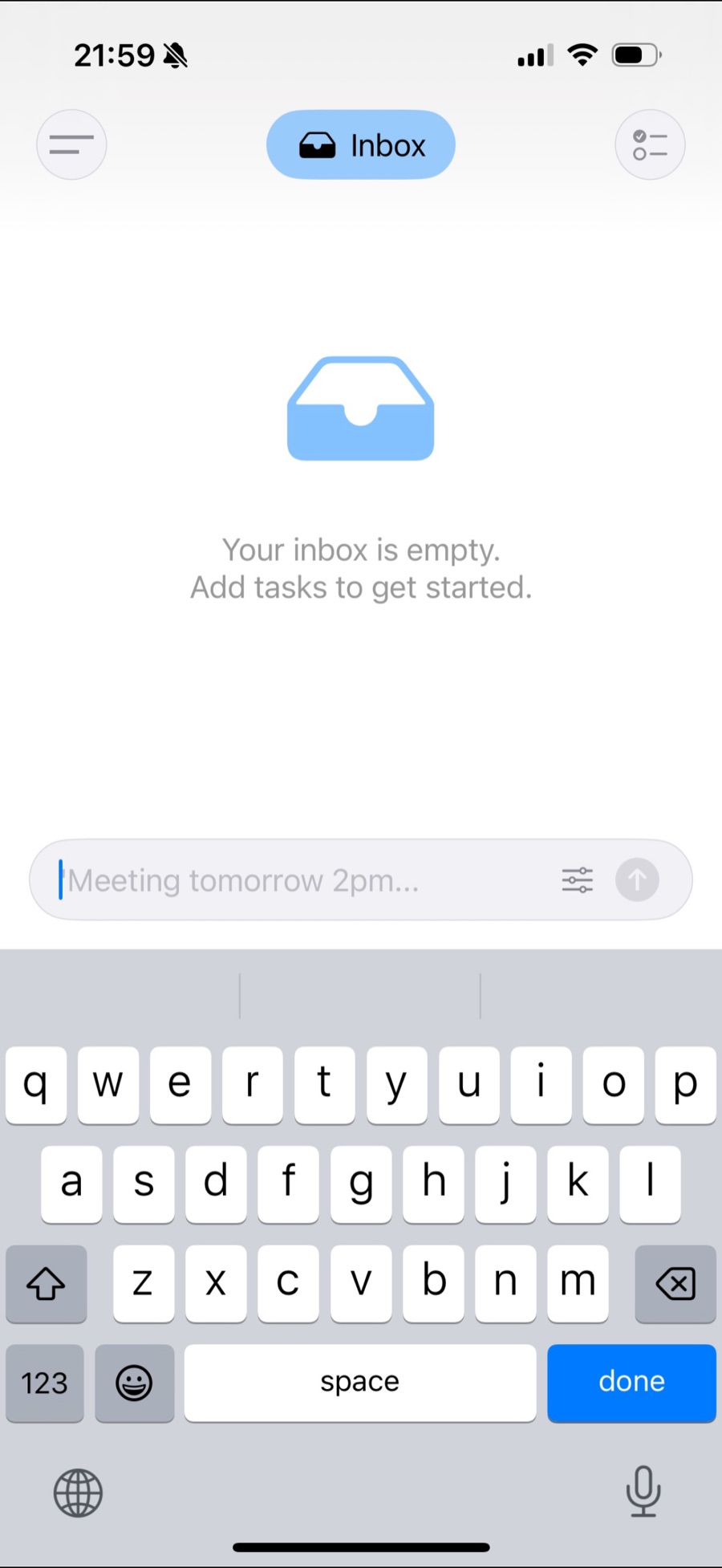
Stack’s input field with the placeholder “Meeting tomorrow 2pm…” above the keyboard

Just type it

Type or say a task the way you’d tell a colleague: “Review the marketing deck with Tom by Friday.” Stack pulls out the task, the person, the due date and a priority, with no form in sight.

More on this
  1. Words about time become due dates.
  2. Action verbs become the kind of task.
  3. People mentioned become collaborators.
  4. Urgent language becomes priority.
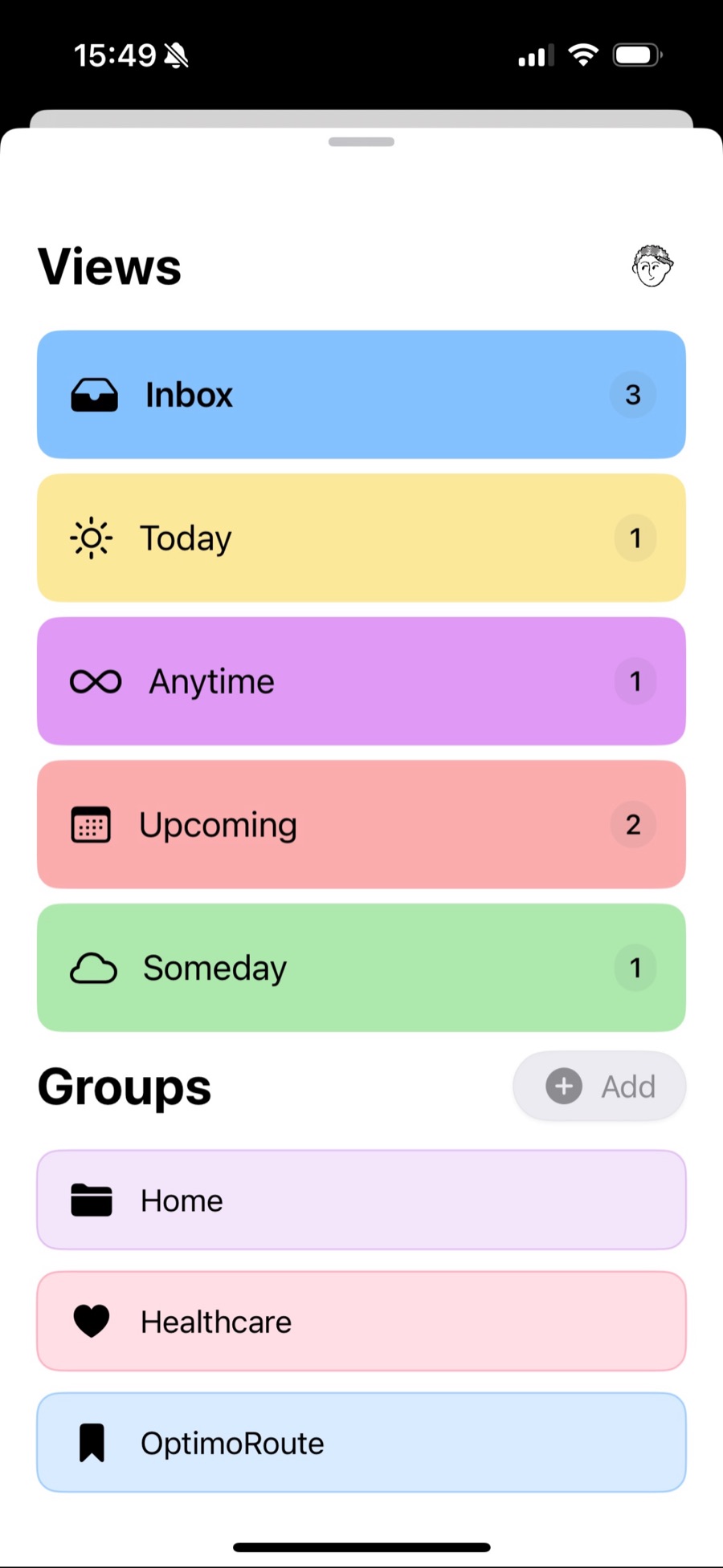
Stack views: Inbox, Today, Anytime, Upcoming and Someday as colour-coded rows, with Groups below

Categories that emerge

Instead of picking a project for every task, Stack groups tasks by what they’re about, so they cluster around projects, people or contexts without manual sorting.

ReframingCategories should come from behaviour, not be imposed up front.

Review deck withTom by Friday Tom Friday

Show what it understood

When you finish typing, Stack shows how it read the task, with one-click edits for anything it got wrong. Anything ambiguous is highlighted for you to confirm.

How it got here
  1. Plain text only. People loved the simplicity but needed proof it understood them.
  2. Live highlighting while typing. Clear, but distracting mid-sentence.
  3. Confirmation after typing, with one-click corrections.
  • Round 1 • 12 peopleValidated plain-language capture, and showed people needed feedback that it understood.
  • Round 2 • 18 peopleImproved how accurately tasks are read, and added visual confirmation.
  • Round 3 • 24 peopleSmoothed editing for anything it misread.
More on this

Where it started: people naturally include context, urgency and relationships when they describe a task. “I should email the client about the proposal changes by Thursday” holds who, what, to whom, about what, and by when.

A final usability test with 31 people, after the three design rounds.

  • 75% less time organising35 seconds to add a task, against 2.3 minutes on average.
  • 94% needed no trainingThey created organised tasks straight away.
  • 89% found it “much easier”Than the forms they were used to.
  • 82/100 usability scoreAgainst 58 for the competitors tested.
In their words

“Finally, a productivity app that doesn’t make me less productive. I just think out loud and it organises everything.” Beta tester

68% of tasks were completed within their planned timeframe, people added 4.2 tasks a day against 1.8 in form-based apps, and 91% said they felt less overwhelmed.

Reflection

Looking back

The hardest part was resisting “just one more field”. Every addition was tested against one question: does this make capturing a task feel more natural, or more complicated?

The main lesson: tools should adapt to people, not the other way round. The best compliment Stack got was that it felt invisible.

What I’d take to the next project
  1. Removing organising decisions freed attention for doing the task itself.
  2. People needed to see how it read their input; showing that built confidence.
  3. Starting minimal and revealing features in context kept it simple without losing power.
  4. Completion matters more than creation, so that’s what I measured.

Thanks for reading